
Adobe Fresco
Fresco is Adobe’s drawing and painting app built for iPad, iPhone, and Windows devices designed to feel natural and intuitive for artists of all levels and experiences. It combines raster, vector, and live brushes, as well as simple but powerful motion features, to enable expressive, high-quality artwork across devices.
I’ve worked on a variety of Fresco features over the last 4 years, see a select few below.
Elements
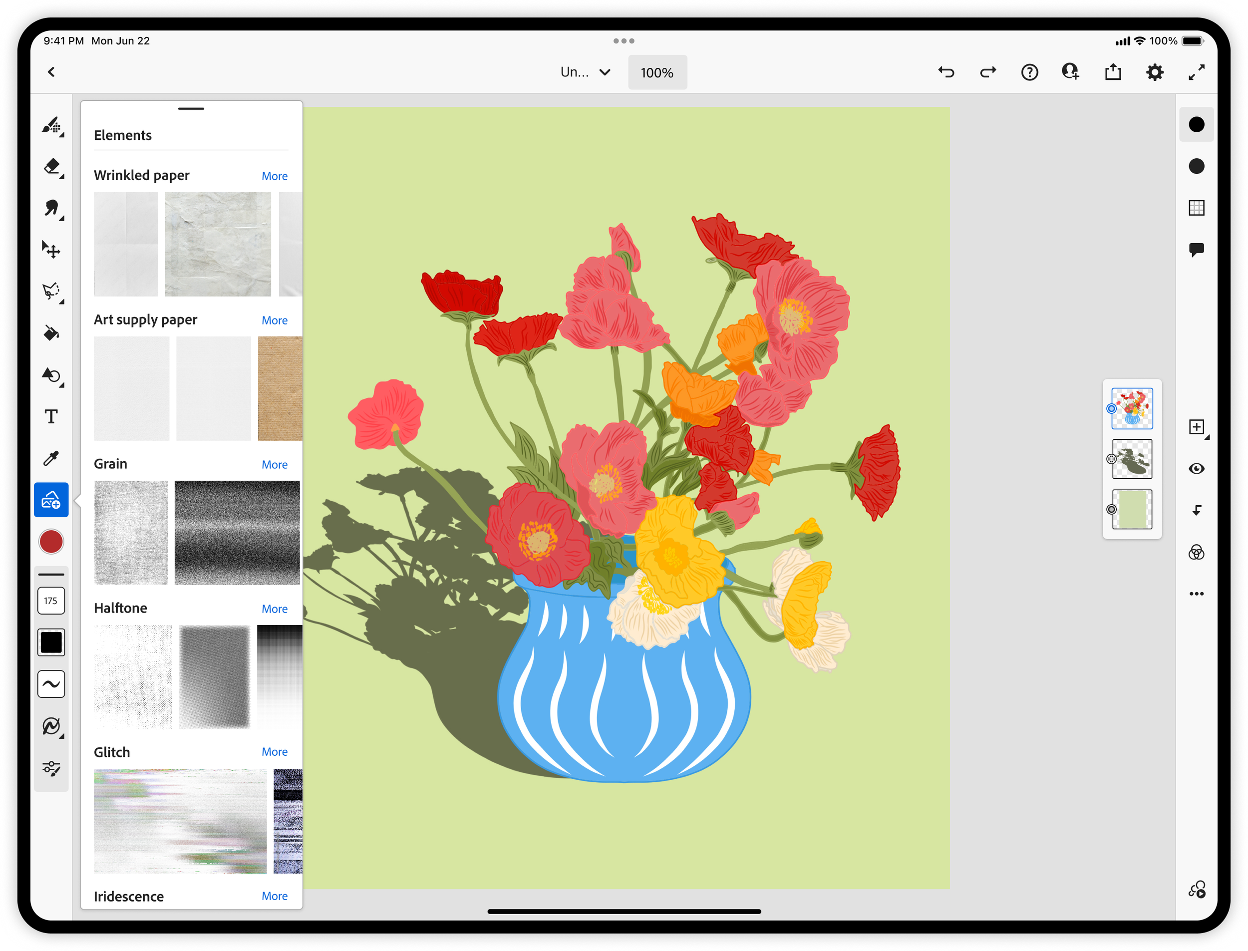
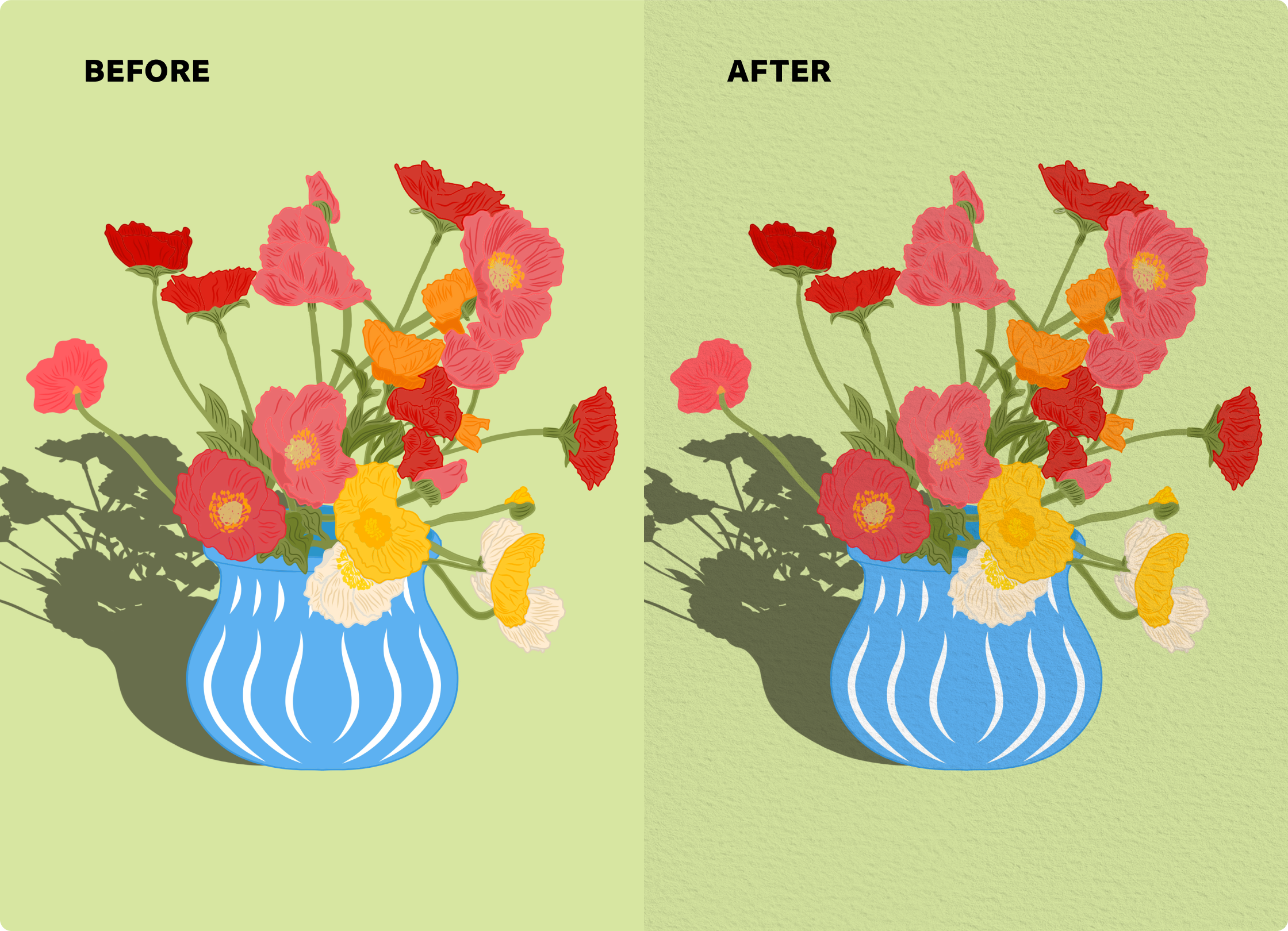
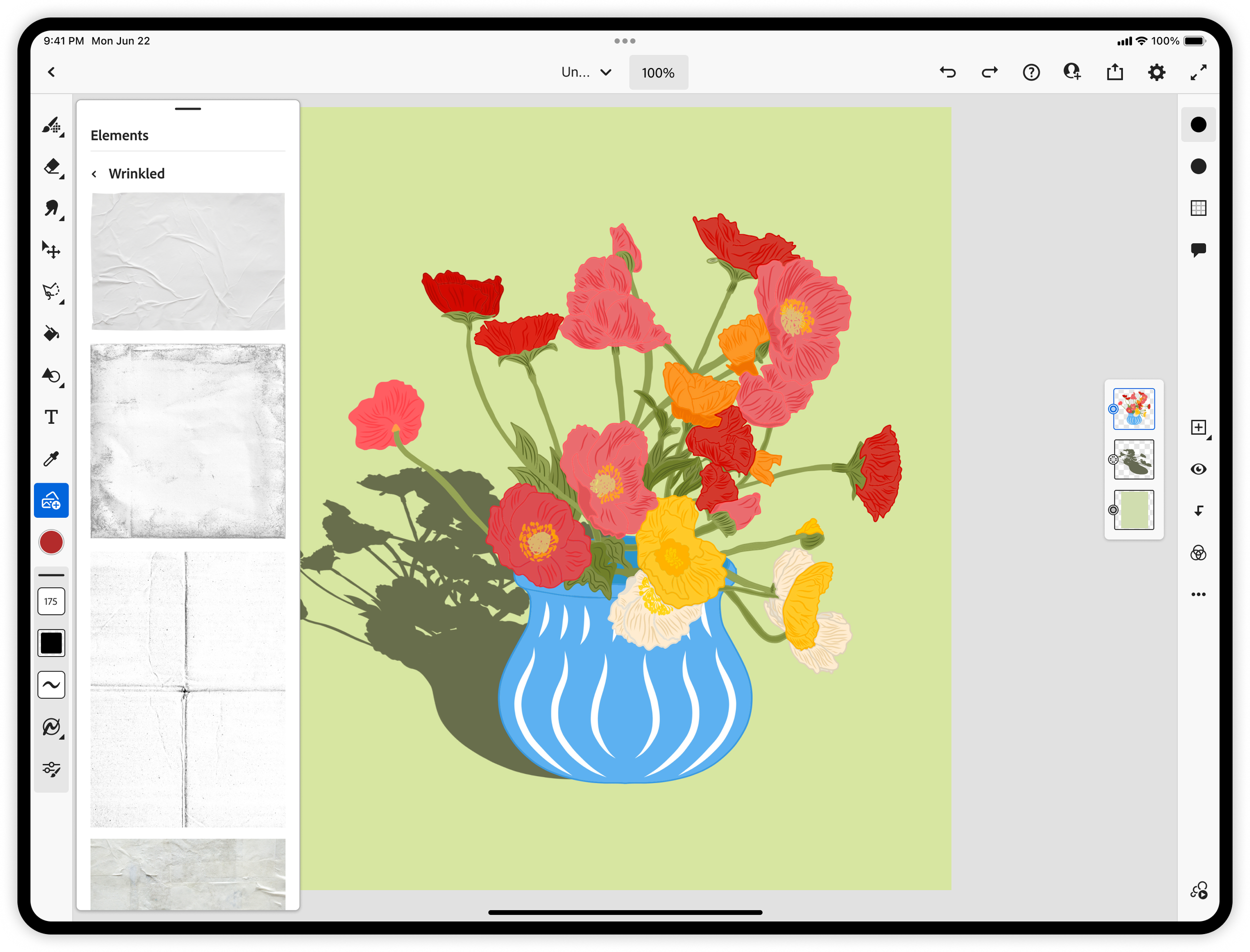
Artists often want their digital work to feel less “flat” and more tactile by adding details like paper grain, fabric textures, or effects such as grain, halftones, gradient overlays. In Adobe Fresco, there wasn’t an easy or integrated way to bring these analog qualities into the canvas.
I designed the end-to-end experience for the Elements panel, enabling artists to browse, preview, and apply textures and overlays directly within their workflow. This included defining interaction patterns for discovering and applying elements, as well as shaping a system of categories that made a large library feel approachable and intuitive.
I partnered closely with Shea Molloy and the Adobe Stock team to curate over 400 free, high-quality textures and overlays, ensuring each asset met the creative and quality standards needed for Fresco. Together, we built a library that empowers artists to quickly add depth, atmosphere, and personality to their work.
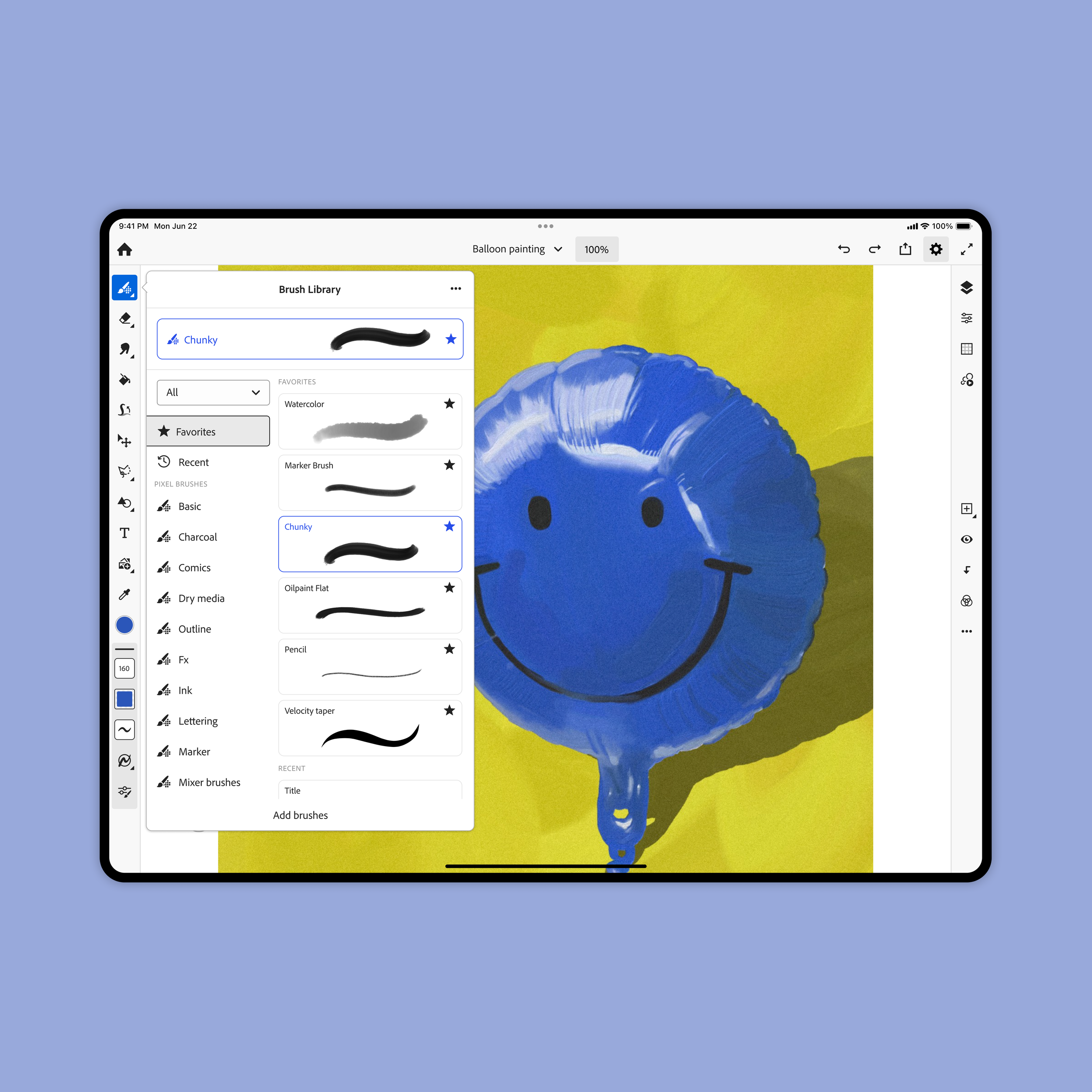
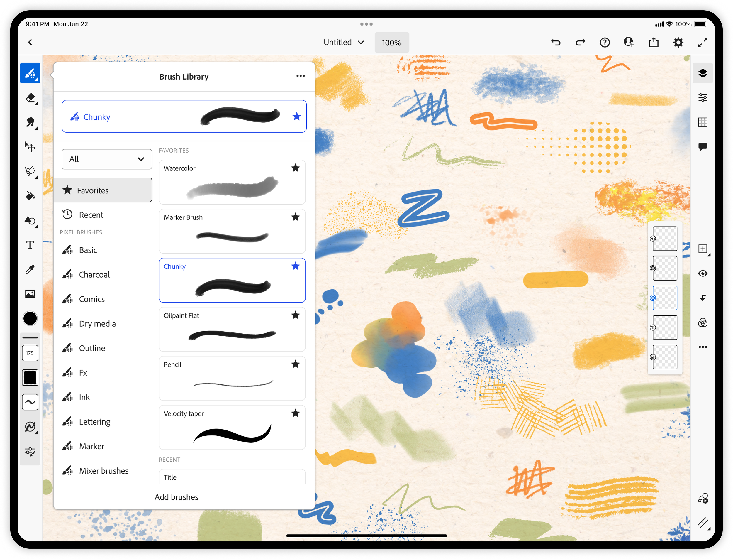
Brush panel update
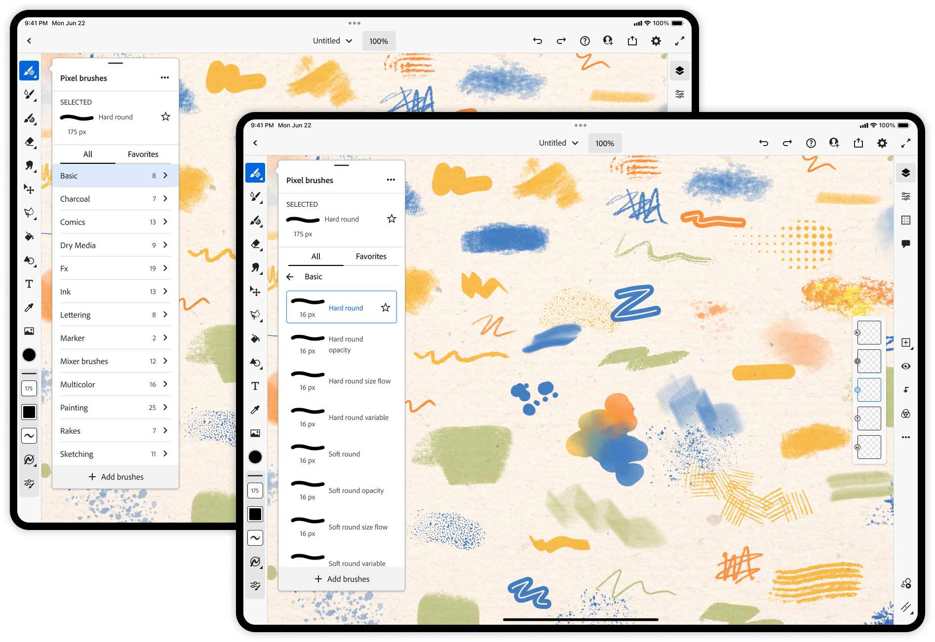
Before
After
I partnered closely with lead designer Zach Gibson to address a clear usability issue: users were struggling to find and discover brushes, often feeling overwhelmed by the volume of options and unable to efficiently locate the right tool for their creative intent.
User testing consistently showed that brush discovery was a major friction point. Users relied heavily on trial-and-error, had difficulty navigating categories, and frequently missed relevant or recently added brushes. This made the experience feel cluttered and slowed down creative flow.
We focused on simplifying and streamlining the brush browsing experience by reducing cognitive load, clarifying visual hierarchy, and improving navigation patterns within the panel. Key improvements included a more intuitive organization of brush categories, faster access to frequently used and recently used brushes, and a cleaner browsing experience that surfaces relevant tools without overwhelming the user.
The result is a more focused, discoverable brush system that supports both new and experienced artists in finding the right tools more quickly, ultimately making the creative process feel more fluid and less interrupted.
Home engagement
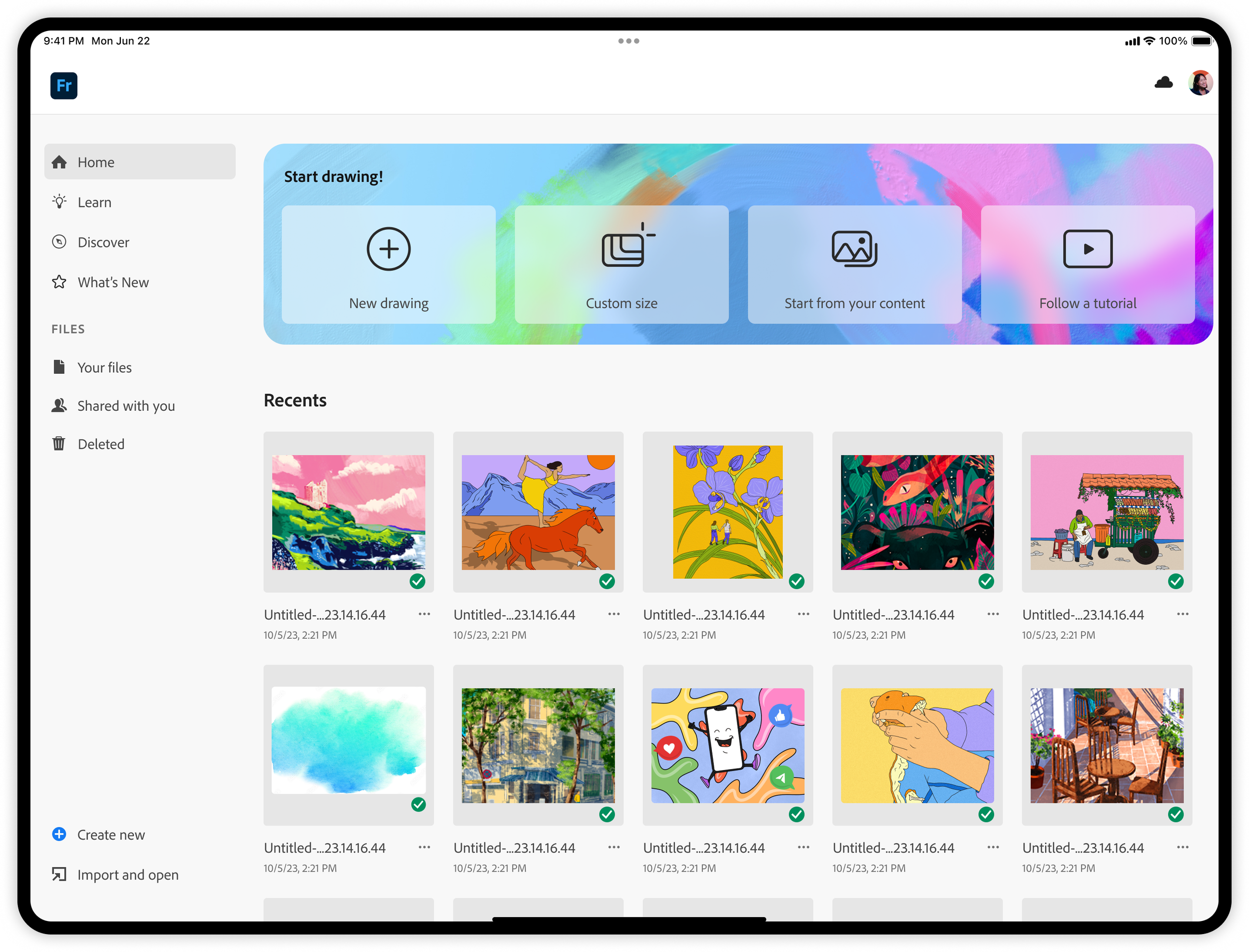
In the Home update, we introduced a redesigned entry experience centered around a new starter container featuring four clear calls to action: New Drawing, Custom Size, Start from Your Content, and Follow a Tutorial. This change was driven by user feedback indicating a strong “blank page” hesitation, where many users felt unsure where or how to begin when first opening the app.
To address this, we focused on creating a more intuitive and welcoming landing experience that reduces friction and helps users immediately move from intent to action. By offering concrete starting points tailored to different workflows—whether creating from scratch, working at a specific size, building from existing content, or learning through guided tutorials—we helped users bypass decision paralysis and get into the creative flow faster.
I collaborated closely with visual designer Marco Mueller from the Brand team to ensure the UI was aligned with Adobe’s brand system while still maintaining a sense of playfulness and artistic expression. The visual treatment of the container is intended to balance Adobe’s brand with expressive qualities that resonate with Fresco’s creative audience.
The result is a more inviting and action-oriented Home experience that lowers the barrier to starting and encourages more confident, immediate engagement with the canvas.